
Juice
Not just particles. It’s the cumulative sensory feedback loop—screen shake, pitch-shifted audio, hit-stop—that turns a click into a visceral impact. We obsess over "juice" because it sells the weight of a fantasy.
Terms we live by.
And what we avoid.
Not just particles. It’s the cumulative sensory feedback loop—screen shake, pitch-shifted audio, hit-stop—that turns a click into a visceral impact. We obsess over "juice" because it sells the weight of a fantasy.
The mental tax of parsing UI. We strip HUDs during "flow" moments (combat, racing) and reintroduce data only when the player breathes. Information is a privilege, not a right.
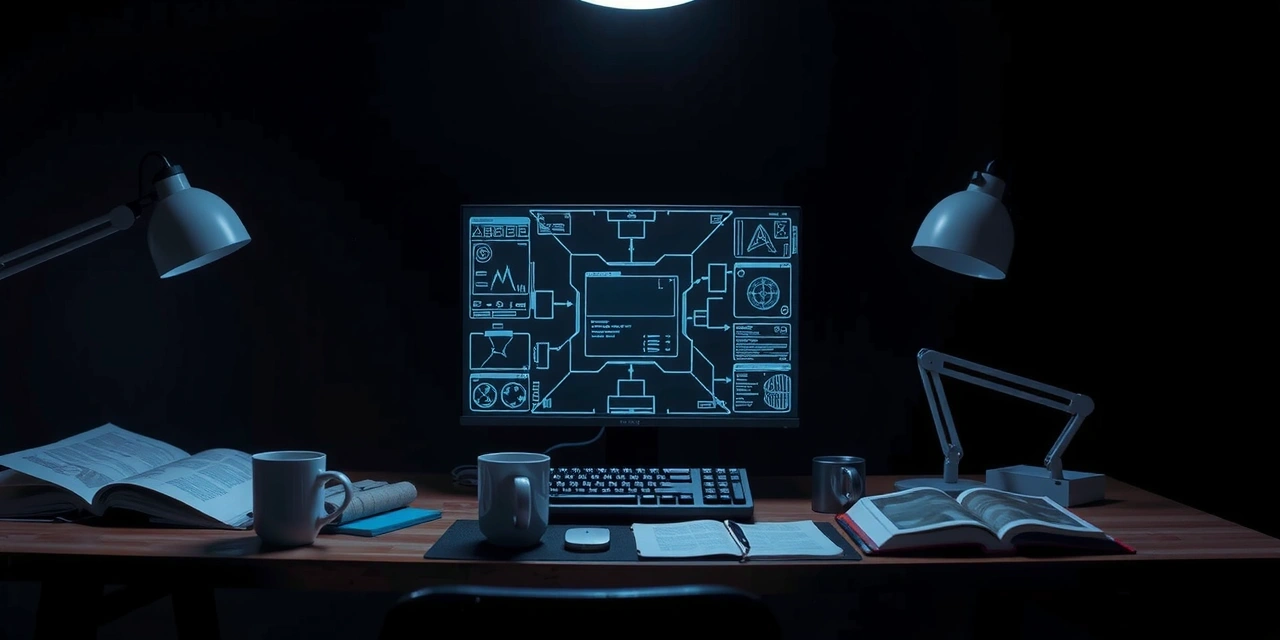
The "Unseen" phase. We build with literal grey boxes and abstract beeps. If the game loop isn’t fun with squares, no amount of polish will save it.
Bad design creates friction (annoyance). Good design creates tension (anticipation). We design loading screens and recovery frames to feel like holding your breath, not staring at a spinner.
Our aesthetic heritage. It’s the narrative density of The Witcher fused with the accessibility of modern mobile UI. It’s not "Eastern European"—it’s a refusal to compromise on depth, even in a 5-minute session.
Client: Indie developer, 4 months into a high-fantasy RPG. They have character models, environments, and a combat loop.
Problem: The combat "feels" sluggish. Hit reactions are ambiguous. Players are dying without understanding why.
Our Move: We pause art production. We strip the game back to "greyboxes" in two days. We implement a "hit-stop" mechanic (freezing the screen for 4 frames on impact) and aggressive screen shake. We test with 0 visual polish.
Result: The "feel" is fixed. The client sees the fix immediately without waiting for animation renders. We saved 3 weeks of rework on polished animations that would have been deleted anyway.
Validated via playable wireframes, not slides.
3 Deadly Sins in Gaming App Design
The Mistake: Showing everything "just in case." Mini-map, stamina bar, cooldowns, kill counter, battery life—all visible in the first 5 seconds.
The Fix: Dynamic Visibility. The UI reveals itself only when relevant. If you aren't sprinting, the stamina bar is invisible. If the mini-map is redundant (linear level), kill it.
The Mistake: A static screen that says "Loading..." with no feedback loop. The player thinks the app crashed.
The Fix: "Playful Loading." We use the loading time to tease mechanics, practice inputs, or show lore snippets. Every second of wait time is an engagement opportunity.
The Mistake: Relying on hidden gestures (swipe down, swipe up) without visual cues or tutorials. "Discovery" becomes "frustration."
The Fix: The "Bloom" Tutorial. We don't use walls of text. We subtly pulse the edge of the screen or show a ghost finger interaction once, then let the player execute it.
Choosing Your Service Tier
Not every project needs the full stack. This lens helps you identify where we can drive the most value based on your current stage and constraints.
Criteria
Pre-Production / Validation
Optimizes For
Speed to prototype, testing "fun", investor pitch visuals.
Sacrifices
Deep optimization. Long-term scalability. Visual polish.
Criteria
Vertical Slice / MVP
Optimizes For
Player retention, onboarding flow, accessible controls.
Sacrifices
Breadth of content. High-fidelity environment art.
Criteria
Launch / Live Ops
Optimizes For
Scalability, performance (60fps), localization, asset pipelines.
Sacrifices
Agility. Lower budget for experimental mechanics.
Bring us your greyboxes or your grand vision. We’ll help you find the fun first.